I will state this as simply as I can. I hate the new look.
It is very difficult to know what threads have been read or not. Really have no idea why the forums were changed.


I will state this as simply as I can. I hate the new look.
It is very difficult to know what threads have been read or not. Really have no idea why the forums were changed.


certainly gonna need to get used to it. i miss the old private message box in the upper corner........
you can't cast a play in hell and expect angels as actors
check out my game blog: https://velveeta3.livejournal.com/

The forums were badly out of date for what version we were using and had to be updated.
However, if you would care to give specific feedback such as what velveeta said about having the Private Message box in the upper corner (right or left side, btw?), we can work on making them as close to what "used to" be as "had been".
I know that no one likes change, but sometimes change happens whether we like it or not. Please bear with us as we try to get things as much like they were as we can, but understand that the forums had to be upgraded.
Thanks for answering Velea.
I also find difficult to spot the threads that have been read and also i have a hard time trying to stay logged on the forums.
I use to keep the page open and refresh it from time to time. It wasn't a problem with the old forums, but this new one is more demanding and wants my user/pass like every 10-15 minutes or so and I cant seem to be able to find the "turn off the autodisconnect" option.
Northwind * Ancient, Crafter, Lairshaper * 100/100/100
Northpole * Spoiled biped * 100 BTLM, 100 CLRC, 100 RVR, 100 RNGR, 100 MAGE, 100 WIZ, 100 SORC, 100 CONJ, 100 SPRT, 100 DRU, 100 HLR, 100 GRDN, 100 MON, 60 WAR, 44 BRSK/SPRM, 40 CHSW * 100 BLK, 100 OUT, 100 JWL, 100 ARM, 100 WPN, 100 FLE, 100 FIT, 100 MSN, 100 SCH, 87 SPL, 85 GTH, 85 MIN
What's the chance of getting it to look exactly like it did within the the new forum software? Beyond the above, the formatting is completely messed up. There are links to things hiding in black bars, links overlapping, pretty much a complete mess.
SiLang Drag 100, Dcra 100, Dlsh 100 100M Hoard Ancient Dragon of Flight of the Order Shard
Parcasta Storm Disciple 44, ARM 88, BLK 100, CRP 25, ENC 23, FIT 88, GTH 80, JWL 40, MIN 80, MSN 82, OUT 100, SCH 100, TLR 10, WPN 88, WVR 21
With the change to the forum look you will also find that almost all older threads have become locked out.
This effects all post prior to March.
That was done a long, long time ago, not with this upgrade.
Last edited by Velea; December 3rd, 2012 at 04:08 PM.
Ah yes, the dreaded "forums run on software that DOES have to be updated some time, you know". Based on my experiences elsewhere, the suffering is evenly distributed between the people using the forum and the people running it.
Wishlist/noticed changes:
- No obvious "new private messages" doohickey/quick notification. || The new "Notifications" might be good enough though.
- I miss a front-page "all new posts" button. I dislike skimming for new posts manually, that made it super easy. || "Today's posts" is NOT a substitute, because I don't care about the absolute time something was posted (I can go an entire day without checking the forums-- shocking, no?), just its relative time.
- Having "mark all forums read" at the bottom AND in a pop-down at the top is nice, I like that. Please keep it that way!
- The new smilies are cute. I'm sure those are just what came packaged with the new software, but they are! Not sure how popular they'll be due to being so tiny though, they're on the outside of what I don't have to squint to see and I'm not the worst-off by a long shot.
Are we still going to have our posts edit-locked a certain period of time after initial posting? I don't know whether that was a particularly deliberate decision on the part of whoever decides these things or not.
All in all, I can't lie, I would have preferred to leave everything precisely identical to the old version into perpetuity-- but that's because I'm a dinosaur. Unless I stumble across some sort of terrible forum-wrecking glitch, I'm sure I'll adjust just fine, this new one looks pretty good. Now if someone wants to make a shiny shiny "all new posts" button, I'd be set!
Also, it looks like the checkbox to remain logged into the forums is gone. That'd be handy to have back.
This is a known issue with the current forum setup, as is some odd bug where every time it auto saves, your mouse cursor seems to jump around. *scowls at mouse as I try to type*
Last edited by Velea; December 3rd, 2012 at 04:58 PM.
SiLang Drag 100, Dcra 100, Dlsh 100 100M Hoard Ancient Dragon of Flight of the Order Shard
Parcasta Storm Disciple 44, ARM 88, BLK 100, CRP 25, ENC 23, FIT 88, GTH 80, JWL 40, MIN 80, MSN 82, OUT 100, SCH 100, TLR 10, WPN 88, WVR 21
There is a New Posts button. It works just like the old one did. Top right hand side, but it needs to be made much bigger and more obvious, that I will say.
Don't think there's a way to have the Mark All Forums Read in both places. But I like it where it is, personally, because I can go right from the New Posts list to the Mark them all read when I'm done without having to go back to the whole listing of forums ... that's one thing I've counted as a "bonus".
As for the "tiny", I keep telling them that the whole font for the forums seems to have shrunk! I want a bigger font without it going bold on me. (And yes changed font sizes through here trying to see what's what)
testing font types as well as sizes...trying to figure out what the old font was versus this new one.
Last edited by Velea; December 3rd, 2012 at 05:00 PM.
The only thing I really dislike about the new layout is the inability to discern threads with new posts in it versus ones that don't, inconsistency in icons (look down the little icons for threads or whatnot on the left side of any list of forum threads; some are oversized, some are new, some are old, ect.), the new emotes (they're a little awkward and don't match the forum's style much to me), and the inconsistency in colors. (The quick reply box is white/gray as well as the under-post reply buttons, and the quoted material)
Most noticeable is the stark contrast of the white/gray vs the tan/brown color scheme. It's a bit ugly and not very easy on the eyes.
Also quick suggestion! On my screen at least, all there is for a background on the left and right is black/gray. Maybe you should put up the website's background as a static locked image to spruce up the forum a bit? I think it'd look neat.
The inability to see which threads I have not read, is slightly distressing, and the having to relog often is really frustrating, but I'm happy with the look.
EDIT: I now see the icon for unread posts, but is it possible to show the thread title bolded as was previously the case?
The location of the login is not good though, as using touch screens means I am more likely to click the banner, rather than the text boxes.
My poor little old phone has a heartache now, but it's only a temp. I think there are some issues with text wrapping on mobile devices, but it would be far too difficult to describe... and the "Mobile style" (selected from the far bottom left corner) probably fixes it, I just haven't checked yet as it's not the default option when logging-in on mobile devices.
EDIT: Mobile style does fix any text wrapping issues, but I don't like the boring lookand it took me a bit to figure out the navigation properly.
EDIT: I also noticed the window has no title.
Last edited by hallucin8; December 3rd, 2012 at 11:03 PM.
Myself, i am pretty happy with the new look for the most part although
- The colour scheme could be revised a bit...tan/brown vs the white/grey looks out of place
- Not being able to easily tell apart threads with new posts is annoying
- Not saving the login...i have been able to sort this out through simply, pressing to make a new thread, then when i log in to do so, it has the option there, which seems to have sorted it; but it was still quite annoyying to constantly log in before i did this
- Some text overlaps. After a few times i refreshed the main page, most text stopped overlapping, but there is still some that overlaps with other text or can't fit in its 'assigned' space on the page.
Actually, I like that size, but it is a personal preference. I can read that just fine without getting a headache due to eyestrain.Originally Posted by Velea

*wince* Please don't keep it that small.
I will say that I find the font as it is right now slightly too thin, which makes for hard reading.
In agreement with all the previous posters about the colour scheme. The tan, is a bit too bright, almost to the point of being magnolia. I'm not sure if it is the tan on its own or if its the contrast of the tan against the grey, but it is not a fun experience on the eyes.
Is there any way to get some sort of pattern involved as opposed to plain colours, perhaps where the tan is? That might break up the shock that the contrast and brightness is causing and make it a bit easier on the eyes.
Also, I noticed there is a blog feature in our profiles? Of course it says it needs a plug-in activated to use or view it. I like that feature and its one that I utilize it in a few other forums I use.
These things are really the only feedback I have on the new format, the rest I can get used to.
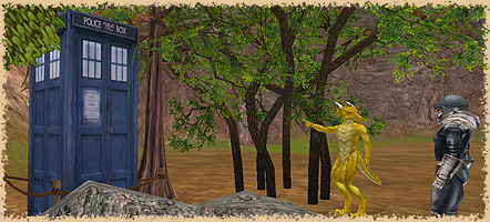
You see an Ice Wall Corner, I see a Tardis."
"Pen Pineapple Apple Pen"

Would be nice to have the private message show a number after it, like it used to. I never will remember to click that link and look for messages. When the numbers changed with a new message, that was noticeable.

When you have a new PM it will show up to the right in the NOtifications section. "Notifications (1)" and will be in bold. When you click on it there's a dropdown that tells you what you have (ex. 1 unread private message).
"Alea iacta est" -- Julius Caesar
Toot shouted, voice shrill, "In the name of the Pizza Lord! Charge!" (Jim Butcher's Dresden Files)
"Everybody is a genius. But if you judge a fish by its ability to climb a tree, it will spends it whole life believing that it is stupid." -- Albert Einstein

Couple things bout the new forums. First tho...I dont mind em. They look a little different and need some tweaking to get things right, but thats how it goes with upgrades.
1. I saw an unusually high number of ppl online so I logged in and clicked "whos online" what I saw was quite a few "Baidu Spider, Bingspot Spider and Google Spider" names. Maybe thats normal...maybe not.
2. While NOT logged into the site and attempting to search for something, it redirects you to a page that requires the "random question" answered. The text for that question is the same colour as the page background atm. I had to highlight the area where the text shoulda been to read it.
3. Across the top of the page (while logged in) where you see... Forums, FAQ, Community, Quick link, Welcome R`aven Sky`Dash etc... I get text overlap with Quick link and my name. Maybe the page just need to be stretched a little wider?
A dark shadow in the night skies...
Overlap with Quick Link and Welcome, that should say.
A dark shadow in the night skies...
This started up again today, so whatever was changed overnight should prolly go back. Most of the afternoon yesterday the login info, notifications, etc were at the very top. Those moved back down over the other links today.
SiLang Drag 100, Dcra 100, Dlsh 100 100M Hoard Ancient Dragon of Flight of the Order Shard
Parcasta Storm Disciple 44, ARM 88, BLK 100, CRP 25, ENC 23, FIT 88, GTH 80, JWL 40, MIN 80, MSN 82, OUT 100, SCH 100, TLR 10, WPN 88, WVR 21
Ah ok...that'd be it then.
A dark shadow in the night skies...
Noticed also with this new Forum, I can not find all my old posts or anyone elses old posts. Used to be able to click on anyones name and find all the previous posts by them.
Click on the person's name and click "Forum Posts". It's right there.
Last edited by Velea; December 4th, 2012 at 05:13 PM.
There are currently 1 users browsing this thread. (0 members and 1 guests)
 Posting Permissions