Oh I hope this is a very very rough draft!
I know that a lot of work has already been put into it, but I'm sorry Amarie, if I was surfing the web to find a new game to play I'd leave the new webpage (as it is right now) so fast you'd get dizzy and get a nosebleed from the speed I left the site.
It does not look anything like a real company's webpage, it looks like someone's first attempt at a webpage from 6 or more years ago. Even my poor attempt at a guild website years ago looks better http://azuretwilight.bravehost.com and that's not saying much.
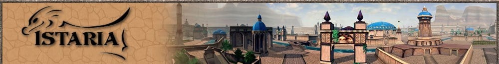
The top of the webpage is garish. http://picasaweb.google.com/Unicorns...62228577176098
You don't need all those little pics behind the title. And in spite of what a section of the U.S. government says, old fashioned typewriter typeface (New Times Roman font) is not easier to read. You also have various text written over the Istaria logo. The background picture of the two battling dragons chasing each other across the clorine gas cloud sky and accidently frying an undead is too bright. You can't see most of the little black text. You need to mute it in some fashion so it stays in the background and therefore the text is more legible. http://picasaweb.google.com/Unicorns...62767851363010
The picture itself is ok, but it needs the stars cleaned up out of it and it suggests PvP and that Istarian dragons can breathe fire while flying.
Into the deepest darkness....
Originally I thought this was all there was to the webpage because if you went further down at all it just was black. http://picasaweb.google.com/Unicorns...62948451959314
It took my son highlighting the webpage to show me that there was actually text! And that there was approximently 6 1/2 screenshots worth of text to scroll down.
http://picasaweb.google.com/Unicorns...64164216986514
http://picasaweb.google.com/Unicorns...65859708073106
http://picasaweb.google.com/Unicorns...66577935845906
http://picasaweb.google.com/Unicorns...66845610914818
http://picasaweb.google.com/Unicorns...67206945412866
http://picasaweb.google.com/Unicorns...67510243639394
http://picasaweb.google.com/Unicorns...67923443864002
Way too much to scroll through!!!
We finally get past the blackness and we get some racial pictures. Not too bad, but why are the characters aligned to the right? I also would of liked to see their backgrounds just a tiny bit more. http://picasaweb.google.com/Unicorns...69448387392354
Yea!! We've reached the bottom of the page! http://picasaweb.google.com/Unicorns...69928957458402
Ah-ha! That's where the music was coming from that I couldn't turn off! We have a video! A video is nice, but having to scroll through so much to find it is a major turn-off.
And we have links! With a Download link!! Great!!! Except for the fact that again you have to scroll through way too much to find them.
Hmmm....more little pictures. The labelling is nice, but when you scroll over them, all the larger racial pictures disappear and don't return except for the one that corresponds to the correct little racial pic. All the black on black text now won't highlight too.
Let's see how some of the other games' official webpages look to see what they are doing right and wrong.
http://everquest2.com
Not too bad. A bit long on scrolling down due to too many news items listed. Could of just used the headlines of the articles instead. Nice big Play Now button near the top. Links to other sections of the webpage easily found at the top, although could of used a slightly larger font or maybe the color yellow to be a bit more noticable.
http://www.champions-online.com
Not too bad. You don't have to scroll much to see the whole first page of the site. Again, nice big Champions Online Play NOW button near the top. Links to the other sections of the webpage are easily found at the top and are very visable. Some nice recent new articles available and an interesting set of videos & articles scrolling quietly.
http://www.guildwars.com
Not too bad. Barely any scrolling needed to see the whole first page of the site. The Try Guild Wars FOR FREE button isn't positioned as well since it is in the lower half of the page, but it is fairly large and towards the center. Links to the other sections of the webpage are easily found at the top, although the font could of been larger. Recent news headlines are good. The link to the GW Wiki in the upper left corner is an interesting touch although I would of put it and the GW Players link in their Hot Links section.
http://www.ddo.com
Not too bad, although a doubleclick ad is a bit tacky. At least the ad block is down towards the bottom of the first webpage. You don't have to scroll much to see the whole first page of the site. The Ready To Jump Into The Action? Play Free Now! button could of been a bit bigger, but at least it is boldly colored and therefore attracts the eye. Links to the other sections of the webpage although having a fairly decent font size and bold coloring are lost abit in the busy-ness of the page due to being under a large set of scrolling pics. It would of been better to of put it up at the very top where the secondary bar of links have been put. Having a set of screenshots & videos to look at is good, but I would of put them above the large news section.
http://www.puzzlepirates.com
Pretty good. No scrolling needed. The PLAY NOW! button is large and obvious. Links to the other sections of the webpage are at the top of the page and are fairly obvious, although they could of been a brighter color to attract. A link to screenshots would of been nice although you do get a fair number of pictures if you do follow the site's links. The link A Guide for parents is a nice touch.
http://www.lotro.com
Not too bad. Barely any scrolling needed to see the whole first page of the site. The Sign Up For LOTRO Today! box is a bit confusing since there is also just above it in the Links the Play For Free link. But it is certainly big enough! Links to the other sections of the webpage are at the top of the page and are obvious. The video immediately playing is a bit irritating, but at least it is at the top of the page and the pause bottom on it is clickable. The Latest News box is nice, I like the scroll bar so the box doesn't take up a lot of room, but I wish it had more than just how much various game sites like what LOTRO is doing.
http://us.battle.net/wow/en
Not too bad. A bit long on scrolling down due to too many news items listed. Could of just used the headlines of the articles instead. Nice big FREE TRIAL button near the top of the page. Links to the rest of the website are at the top and obvious. News box is too long. It needs to be just headlines.
http://www.wurmonline.com
Not too bad. A bit too long on scrolling due to an article about the changes in Wurm. The Click here To Play Now! button could be bigger, but it has bold coloring and is near the top of the first page, so it is fairly obvious. Links to other parts of the website & other important places is fairly obvious at the top of the page, although the font could of been a bit bigger. A menu down the left side of the page also helps. (I know, old school, but some folk don't understand dropdown menus.)
http://vindictus.nexon.net
Fair. This is a bit busy and you have to do some scrolling to get to the bottom of the first page. The Download VINDICTUS & Free SIGNUP buttons are obvious though and the links to other parts of the website are too. The video is obvious at the top of the page, but again it you have to hit the pause button if you don't want it to automatically play. Again, general doubleclick type ads is tacky. (My gut feeling about them is the game has to have supplemental advertising just to try to keep afloat or they are being just super greedy.)
Ok, with looking at other sites, here are some basics.
1. Make the PLAY FREE! DOWNLOAD HERE! button/buttons big, bold, and near the top of the page.
2. Don't make the background picture the only thing a person sees first. It is suppose to be in the background! The viewer will want easily comprehended info more than pretty eyecandy. Eyecandy is important, but if the viewer can't find what they want in just a couple of eyeblinks they most likely will move on.
3. Don't make the viewer scroll down forever. We bore extremely quickly. If you have a lot of info, put the access to it in various other pages and link them via a menu.
4. Make your menu links/dropdown menus obvious and at the top of the page.
5. News headlines are good, but only if you keep up with them. If you do a News section, then please, please, please add in new stuff often, even if it is just a new screenshot or guild announcement. Fossilized news sections scream dead game! It is better not to have a news section on the official site compared to one that doesn't get updated regularly.
6. Screenshots and videos are good as an extra teaser. (Personally, videos that automatically play are irritating.)
The old page wasn't too bad. The GET THE FREE TRIAL NOW button was certainly big enough and it was on the upper part of the page. It needs to be updated with Free To Play! & Download Here! statements. Or do fake sectioning of the pic so it looks like you have three buttons. One saying 14 Day Trial!; the next Download Here!; and the last saying PLAY FOREVER FREE!.
The screenshot section is fine, but unless you are going to update often, lose the Current Event, News, and In The Press sections. Right now they are so fossilized it screams dead game.
Instead, maybe rotating pictures of the various races with a corner banner saying, 11 Playable RACES!. And another of clickthrough pictures of groups of players and various players crafting or building housing with a corner banner saying, Family Friendly! No PvP Servers!. (We can't quite say no PvP since we do have the arena area.) And a third set of rotating pictures showing hatchlings, adults, and ancient dragons with the corner banner, BE THE DRAGON! LEARN TO FLY!. Just don't make them all automatically rotating or it becomes too flashy and distract rather than attracts. (Too minimalistic is deadly, but too busy is almost as bad.)
Or more videos!
I hope my writing hasn't dismayed you. It is just that first impressions really do matter when there is so many gaming choices clamoring for our attention. And I want Istaria's official site to look so delicious and professional that it wins the viewer over immediately causing them to click the Download Now! button.
Unicorn's Lady