I agree, that's exactly what I thought too. But I saved the old logo, will have to upload it somewhere for everyone who wants to get it back.Originally Posted by gopher65


I agree, that's exactly what I thought too. But I saved the old logo, will have to upload it somewhere for everyone who wants to get it back.
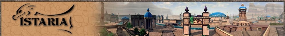
I agree. The new logo is nice and simplistic, but it just isn't RIGHT. Sure, it looks like a dragon/chicken, but it has a completely different presentation of what it's supposed to be like in the game. The logo is modern for a medieval game. It has no trappings of magic, or crafting, or war, or excitement... to be blunt, it's just wrong for the job.
The old logo was better: it showed the same image essentially, a dragon, but the presentation was much more suiting. (it beheld more interest in it's colours too).
So maybe if they could work with the original logo to make something displaying the same themes that'd be better. I hope they don't intend to keep the current logo. It's made of fail. No offence to any of the devs, but it is. :/
Look at World of Warcraft's logo. Sure it's more complex, but it fits and does it's job. The devs wanted to get away from Horizons seeming like a dating site for someone who doesn't know it well. But the new logo looks like it's for a dating site!
Sorry, but it really needs some serious rethinking. Personally, I'm all for a contest to decide the new logo.
Huh, really? That'd actually be kinda neat.

to be honest justa for once you and i are in 100 % agreement it looks like a deformed hachie to me it needs to be redone
Face forward and you should be able to hear it now the only thing plugging your ears is your own fear. There is only one enemy and one of you so what is there to be afraid of ? Abandon your fear turn and face him, Don't give an inch. Now advance Never stop If you retreat you will age Be afraid and you'll die NOW SHOUT OUT YOUR NAME !!!
I have to say I also preferred the old logo
Anril Firestorm 83 Dragon/100 Dragon Craft/37 Lairshaping Anrill FireBlade Human "Jack of All Trades" (in Training)
It looks cute and all, but I have to agree with liking the old one better. This new one just doesn't have any kind of pizzaz to it at all.
Ummmm, not to make anyone feel bad. But the first question that popped into my mind when I saw it was. "Is that a dodo bird?"
My other thought was, I seem to recall it was a contest someone won that created the old one
I hope I don't get myself in trouble here, but if any developers are watching, this is exactly the sort of thing I'd love to do.I love painting, and it's my career. I've not been able to offer to work on the art team because I can't do 3D stuff (skinning and the like is a bit beyond me), but I would love to work on 2D imagery that could help make the game richer.
Big crunchy ancient dragoness of Order
Have to agree, really don't like the new logo, the old one fitted the game this new one doesn't

I agree to what is said too.
Mabey they should have a 'design our new logo' contest, due to the general dissent of the community...
Havin a logo made by Nambroth would be truely awsome. She's an incredibly talented artist, as you can see in her DA gallery.

I was thinking of spelling out "ISTARIA" with each letter being a texture of the crafting schools and the font being done like LucasFilms arch.
the "I" could have a Metallic texture (for Iron)
The "S" could be a Brick wall texture (For sandstone)
The "T" could have a wood texture (for Tree)
The "A" could have a red Apple skin (for confectioner)
The "R" could have a glowing look (Radiant essence)
The "I" could have a material look (Ironsilk)
The "A" could have a crystal look (for Azulyte)
With a cloth banner (tassles on each side, bent with an "S" bend on either end with the words "Chronicals of the Gifted" across it)
Meh.... I digress.
Justa Mirage: Ranger 100 / Healer 92 / Carpentry 100 / Confectioner 100 / Fletching 92 / Weaver 62 / Gatherer 34
Flatspin: Ancient Lunus Dragon 100 / Craft 100 / Lairshaping 100


Did you saw the new splash screen? The dryad rendering looks cool
»• Adventurer 100 | Crafter 100 | Lairshaper 100 | 100 Million Hoard | Expert Dragoncrafter | Expert Lairshaper •«
Ehehehe. I always liked that Dryad picture.
That new graphic is just horrid! Are you guys sure this isn't part of the April Fools joke? I can't tell which it reminds me of more, a dodo bird like Jayne said, or some puppet from a kids show, or a cartoon off of an old cereal box. I certainly wouldn't want it on any images I uses as desktop wallpaper, and I wouldn't want it on any logowear or coffee cups. It makes me feel like I am about to log in to some horrific world reminiscent of Fraggle Rock.
"Everything should be made as simple as possible, but not simpler."
- Albert Einstein

I saw it immediately as a stylized dragon right off the bat. I thought it was rather neat.
Only thing I had a problem with was it was sort of ghosty, as though there's only the impression that the dragon is actually there.
But, yes, I do want to see more dragon and less stylization.
Wings, scales, fangs, spines, wingsails, wingspars, tail, etc.
C`gan Weyrsinger, blue Tagath's rider, WorldProjects Team Lead Emeritus
Tagath, blue Lunus "for the breath weapon"
Located in sunny Acul on Trandalar, Order shard


as much as i love being the voice of horizons, i must agree with those who find the new logo unloveable.
i think it looks very amateurish and temporary, and i am hoping it is not the permanent logo.
you can't cast a play in hell and expect angels as actors
check out my game blog: https://velveeta3.livejournal.com/
the screen I got when I logged OUT is rather prettier - two dryads, very nice colouring, looked far better, and was good imo..
Bobda Bilda (Chaos) - www.hzconfectioner.org.uk
http://www.painefreecrafts.com - what takes up most of my spare time now..
yeah i like the new login/out screen as well. very lovely.
you can't cast a play in hell and expect angels as actors
check out my game blog: https://velveeta3.livejournal.com/
There are currently 1 users browsing this thread. (0 members and 1 guests)
 Posting Permissions