Oh my yes! much better. I can see everything now, but under the Characters section, did Dralnok get a mountain range named after him too or is that supposed to be Dralk?


Oh my yes! much better. I can see everything now, but under the Characters section, did Dralnok get a mountain range named after him too or is that supposed to be Dralk?
Much better now that there's actual *text* on the page, but it's still missing headings, and that *is* an important part of optimisation.
I'm not sure the "is there" questions in the box are giving the right message - I'd do it as bulleted facts rather than questions:
- Build player communities with hundreds of structures and 3D dragon lairs
- Craft your own tools, weapons, armour and spells
- Play a human character for free
- Kesqui - Formerly of Ice, now of Chaos, lair in Liak
First Rebirth 12-12-2003 / Ascended to Ancient 12-12-2010
This is much better!
I'd still suggest toning the background down a bit. A few 5-second adjustments in any image editing program would help. Reduce the saturation, even if only a little, and the contrast too (but especially the saturation). Right now that background is fighting as hard as it can to be the main focus of the page, which you don't want. Erm. Do you?
You want the content to be the main focus, while the background accents and provides further interest.
Big crunchy ancient dragoness of Order
Well although I do like it, there are a couple issues that mean I actually prefer the current one.
First problem is -and this is a personal thing- I don't like web pages that look like they're floating in space. It's uncomfortable. Usually websites I feel most inviting are when they have information on its own background, and that background is solid -kind of like what we have now. You have your pretty pictures down each side, your solid section in the middle, and your info on that section. Like what the other new pages seem to have. This new landing page just has the information slap-bang on lots of colourful pretty pictures -and they are pretty, save for two problem areas at the bottom (I'll get to those)- but they make it float in space and distract you from the really important stuff, which is the text.
Second problem is the pages that DO follow the whole pictures at the side/info with a background rule. They still manage to float in space because the information scrolls and the pictures don't scroll with it. It's disorienting for me, I can't look at it. What makes it extra-frustrating is that the landing page DOES scroll all together. I know you're not finished yet, but make sure that you don't have one page scrolling and the rest not scrolling. Consistency is veery veeeeery important.
(Also, as a side note, you don't need to go 'WINDOWS VISTA IS NOW SUPPORTED' on the hardware requirement page. It's been supported for a while now. Just include Windows Vista in a list of the OS that the game runs on.)
Back to the landing page. To be fair, I do think it's really nice how the dragons sort of hug the video like that. The dragons are well done. They eat your attention, but they're well done. The zombie guy in the fire is also well done. Hardly look like game models at all. The Elf and the Dwarf at the bottom, though... owch. Not only are their images sharper (making them inconsistent with the dragons and zombie, irking) they're nowhere near as classy. I'd even go so far as to say they look a bit crappy. A lot crappy.
Okay, they look very crappy, alright?
Please, get rid of them. Please.
Next problem is the main menu at the top there, the 'download' and 'free to play' buttons, and the logo. I'll talk about the logo first.
Never let your background swallow your logo like that. Defeats the point of having one. It needs an extra border to contrast with, give it a background or something, anything to seperate it from the background image.
Your menu feels like its floating around very randomly, as do the other buttons. Just a symptom of the problems I mentioned earlier.
Take a good look at this page: http://us.battle.net/wow/en/
See how the menu and the links are all intergrated nicely? Everything attaches to something else. This is the problem I'm having with your page. Nothing attaches, everything just floats. It feels amateurish.
Blah blah, big problem with the 'Free to Play' button.
Don't try and fool your customers like that.
They see 'play as a dragon!' 'Craft the world!' 'Huge great MMO!' and then they see 'Free to Play!' and they have a heart attack.
Then they download the game, try to play and - what's this? It said it was free to play, but now it wants my paypal details! Let me play my game!
Nope, conditions, conditions, conditions. Don't say it's free to play if it's not. We know HUMANS are free to play, so if you want to chuck that around, you should say that HUMANS are free to play. Everything else; 14 day free trial. I'm sick of being decieved.
Nothing much more to say, except beware the labyrinth of information. Make sure visitors can get in on the important stuff easily: they want to know the pros of your game, how to get in contact with support, how to get in contact with players, hardware requirements and pricing. Make sure the route to that information is a) direct from your landing page or b) obvious as hell. I'd definitely make sure you have a support link on the landing page.
Edit out the portion where it says dryads get flight. Dryads do not fly, they just hover above the ground.

Page looks nice, but here's a tip:
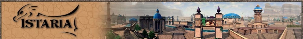
Screenshots - only use screenshots from systems with max viewdistances, and terrain clutter enabled. Istaria looks rather nice actually, so you should show it in its full glory...
Some of us like to act as photographers in the game - take interesting shots of beautiful locations, and paying attention to lighting conditions etc. I'm sure others, as I, have screens available for your consideration..

Been busy so haven't had a lot of spare time.
It looks much better than the first one and I can see a better layout/style.
To me I still think there are some things that could be improved.
- Instead of using images for the main text (png's), use actual text as H1, H2 (as kes said) and CSS to style them. The selling points just arent strong enough (imho)
- Take out the javascript running on the buttons and use CSS instead (the majority of search engines do not like javascript and you can get the same functionality using CSS which is search engine friendly). You need to get away from using images as anchors and use CSS styled lists or headers.
- I would run the menu bar (Home, FAQ, Community, Screenshots) from the left edge of the video, to the end point of where it is now. I would add 'Lore', 'Dragons', 'Building', 'Classes' and maybe 'Sandbox' (sandbox is very much a buzz word for MMO's at the moment, and a term I'm going to add onto CD when I get time. All these buttons need their <title> tags setting.
- Put Download onto the main menubar as well. (make sure that 'Download' and 'Free to Play' are on every child page.
- Now there is free space where the Free to play button is, this can be turned into another <div> floater area where you can add bullet points for the free to play options and add a hook ("Play Istaria for No Cost, You'll be inspired by the depth of our World" - or something along thoses lines, needs good H1 keywords).
- Try to move the Purple dragon on the background or resize it, its being obscured by the floating divs.
- There is unused space in the bottom right corner maybe stick a saris or sslik or dryad. Many ppl are sick of human based characters and love different races.
- If possible try to split the background image into separate images (use div's) so that you can set separate <alt> tags (IE <alt="Adult Flying Dragon playable in Istaria MMORPG">). Easy extra keywords onto a page
- As already mentioned the dwarf just doesnt look right, seems very sunburnt (imagine a dwarf sunbathing = EEK, I'd hate to be the person that has to apply the sun cream to that thing.........)
- Not really looked at the child pages yet, more focused on the main page for now.
There are currently 1 users browsing this thread. (0 members and 1 guests)
 Posting Permissions


